close

enquiry
close
Select a Venue
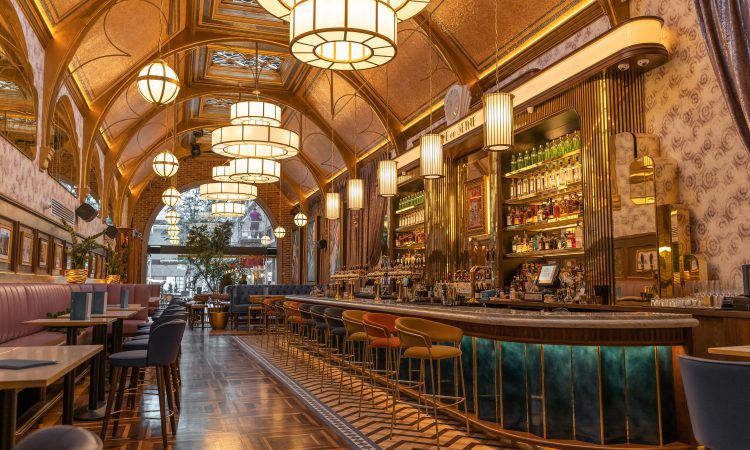
Café en Seine
Restaurant, Bar & Parisian Street Garden
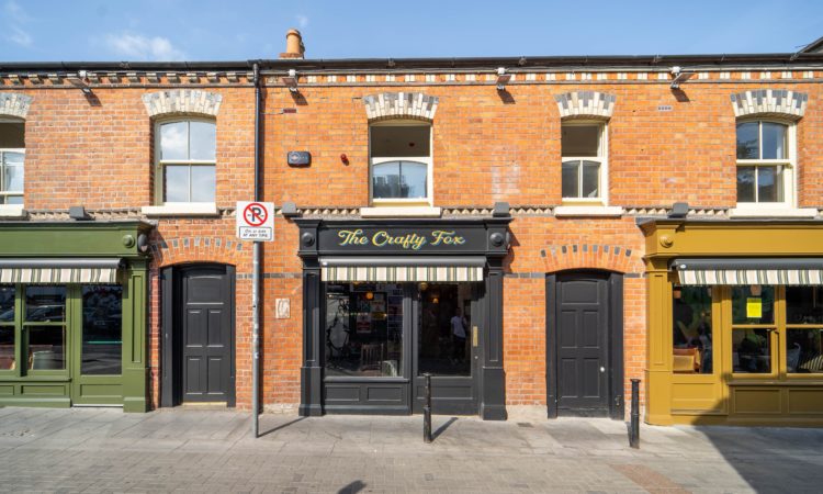
The Crafty Fox
Traditional Bar with a twist
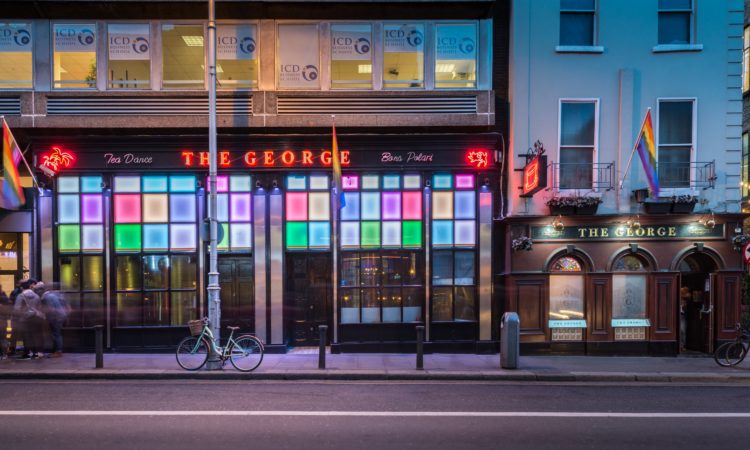
The George
Ireland’s most famous LGBTQ+ bar & club
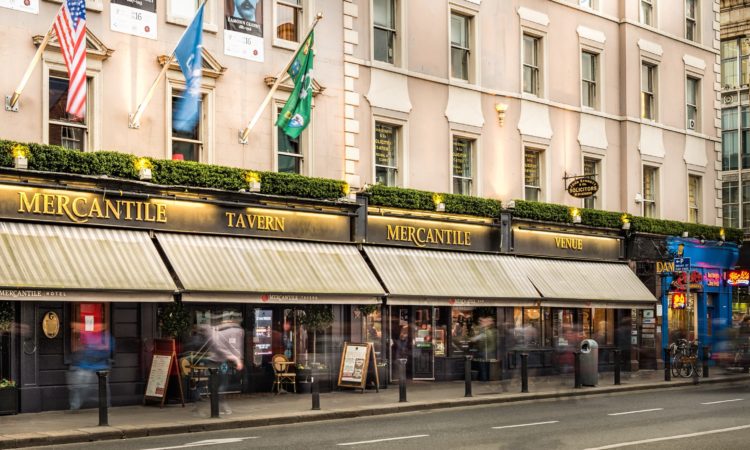
The Mercantile
Hotel & Traditional Sports Bar in the heart of Dublin
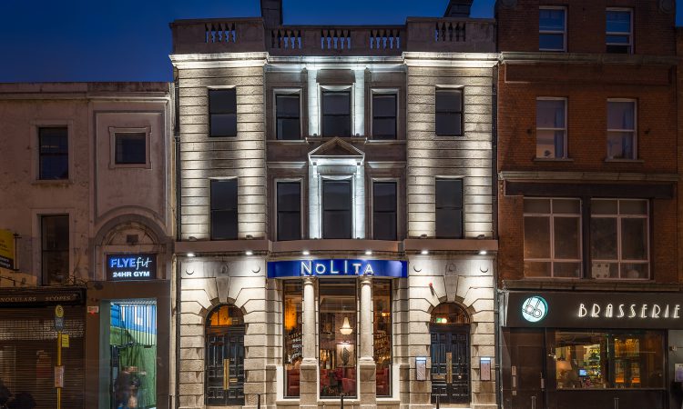
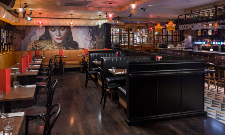
NoLIta
Where eats, drinks & the good times commence
Opium
Thai-Vietnamese restaurant, Cocktail Bar & Nightclub
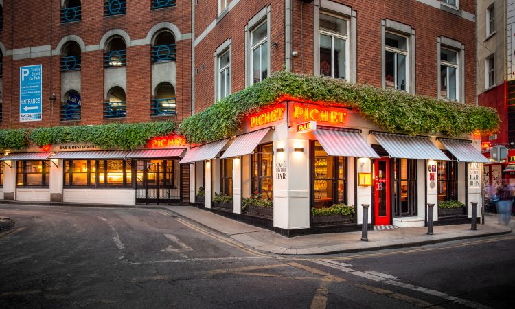
Pichet
Bib Gourmand eatery serving French inspired cuisine
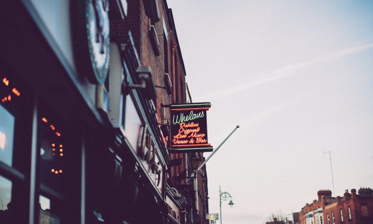
Whelan’s
Famous live music venue & bar
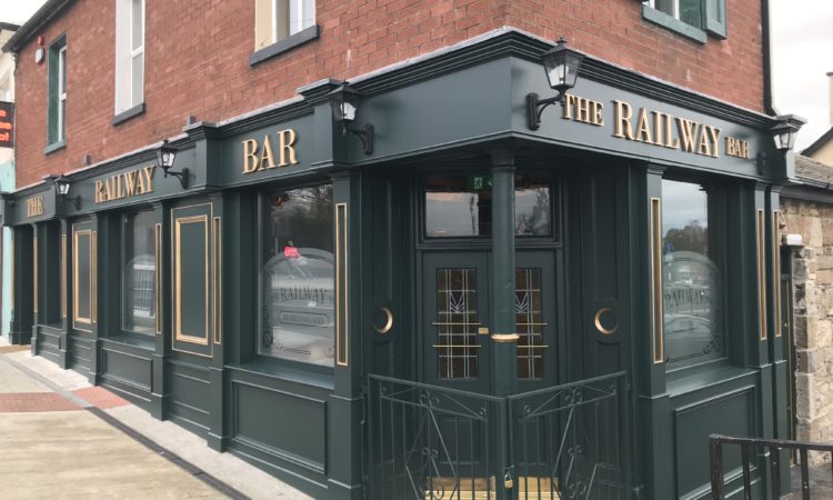
Railway Bar
Pub, Bar & A Home Away From Home